The Hertzsprung-Russell Diagram
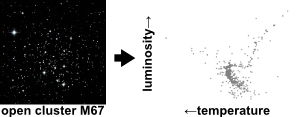
of a cluster of stars.
Many scientific discoveries are made first theoretically and then proven to be correct, or nearly so, in the laboratory. That was not the case however, for the Hertzsprung-Russell diagram. A significant tool to aid in the understanding of stellar evolution, the H-R diagram was discovered independently by two astronomers in 1912 using observational comparisons. They found that when stars are plotted using the properties of temperature and luminosity as in the figure to the right, the majority form a smooth curve. The actual properties originally plotted were properties which can be determined observationally. Probably more like the absolute magnitude (Mv), which is determined from how bright the star looks from Earth and its distance away, versus the B-V color index. This index comes from a difference in the amount of blue light a star emits and the amount of visual (more green) light emitted and is related to the temperature. The resulting diagram was named after the two discovering astronomers, Ejnar Hertzsprung of Denmark and Henry Norris Russell of America.
Imagine plotting a random sampling of stars from our galaxy. The majority of these stars when plotted on an H-R diagram go down from left to right in a diagonal line. The temperature scale along the bottom axis goes from coolest on the right to hottest on the left. This is contrary to the normal convention, where values increase going left to right on an axis. The Luminosity scale on the left axis is dimmest on the bottom and gets brighter towards the top. This places the cooler, dimmer stars towards the lower right and the hotter, more luminous stars at the upper left. Our own star, the Sun, is nearly in the middle of both the temperature and luminosity scales relative to other stars. This puts it around the middle of the diagonal line.
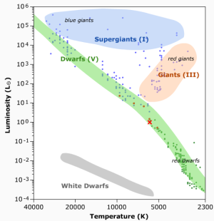
The stars which lie along this nearly straight diagonal line are known as main sequence stars. The main sequence line accounts for about 80% to 90% of the total stellar population. The basic H-R diagram is a temperature vs. luminosity graph. The temperature may be replaced or supplemented with spectral class (or color index as noted earlier). The main spectral classes in order from hottest to coolest are O, B, A, F, G, K, and M. These classes have particular colors. Spectral type is most often written across the top of the H-R diagram going from hot, bluer “O” stars on the left to cool, more red “M” stars on the right.
Stellar luminosity, or a stars “brightness”, depends on two things, its surface area and its temperature. The Stefan-Boltzmann Law gives us this relation:
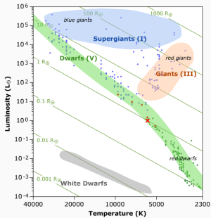
where L is the luminosity, R is the stellar radius, and T is the temperature (alpha is a constant). From this we see that stars above the main sequence on the H-R diagram (higher luminosity) , with the same temperature as cooler main sequence stars, have greater surface areas (larger radii). Also, stars that have the same luminosity as dimmer main sequence stars, but are to the left of them (hotter) on the H-R diagram, have smaller surface areas (smaller radii).
Bright, cool stars are therefore necessarily very large. These enormous stars are called Red Giants and lie above the main sequence line. Antares is a good example of a red giant. Its temperature is a cool 3548 K (the Sun is about 5770 K), while its luminosity is about 50,000 times brighter than the Sun. This must mean that it has a very large radius, in fact about 600 times larger than the solar radius! Similarly, stars that are very hot and yet still dim must have small surface areas. These small, hot stars are called White Dwarfs and lie below the main sequence. They can have radii as small as the Earth, having temperatures around 10,000 K.
Looking back at the Stefan-Boltzmann Law we may notice that by holding R constant and plotting the luminosity as the temperature varies, we generate a set of diagonal lines. These constant radius lines go from the upper left to the lower right (negative slope) of the diagram. Figure 12.19 shows these constant radius lines on the H-R diagram. Stars fall into three general categories. These categories are main sequence stars, red giants, and white dwarfs. It is important to note that the location of a star on the H-R diagram does NOT relate to its position in space. In fact, many of the brighter stars on the diagram are not among the closest to Earth.
There is a correlation between a main sequence star's mass and its luminosity. Stars that are higher up (brighter) on the main sequence are more massive. This correlation is known as the Mass Luminosity relation. It says that the stars luminosity is proportional to the cube of its mass.
Main sequence stars more massive than this relative to their luminosity would be in danger of collapsing under their own gravitational force. Stars less massive would be blown apart by radiation pressure from the intense luminosity.
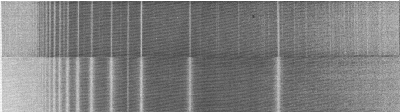
Stars may be split up even more than just into Giants, Dwarfs, and Main Sequence stars. The spectral class of a star is closely related to its temperature. This class is actually determined by the lines in the star's spectrum, which are heavily dependent on temperature. Spectral classification can place a star on the horizontal axis H-R diagram, but what the vertical axis? We need to classify stars according to their luminosity. Doing this would allow us to convey a lot of information about a star by its spectral and luminosity classification, including placing it fairly well on the H-R diagram. One way to classify by luminosity is to look at the star's spectrum. This time instead of looking at which lines are present, as we do to get the temperature or spectral class, we look at the width of the lines. It turns out that more luminous stars have narrower spectral lines than less luminous ones of the same spectral class. For example, in the figure to the right the lines of the class Ia star are much narrower than the class IV star.
The luminosity classes are labeled I, II, III, IV, and V, where I is the brightest and is split up into Ia and Ib stars. Our Sun is classified as spectral class G2 and luminosity class V, placing it on the main sequence nearly in the middle.
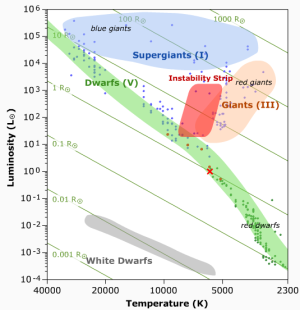
Some stars have times in their evolutionary track where they are not in equilibrium. These stars pulsate, expanding and contracting like a lung. It is a battle between the thermal pressure in the star and its gravitational force. When stars are in this state of imbalance or instability, they are crossing an area called the Instability Strip on the H-R diagram. This is an area around 1000K wide that sits above the main sequence, as shown in the figure to the right.
Stars called Cepheid Variables are an important type of star in this state. They are used as distance indicators (standard candles) because the period of their pulsation varies in proportion with their luminosity. Cepheids are near the top of the Instability Strip. Other notable stars in this region of the diagram are W Virginis Stars, around the middle of the strip, and RR Lyrae Stars towards the bottom.