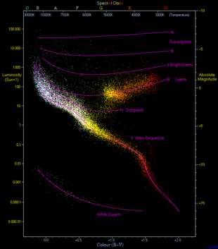
The HR diagram (Hertzsprung–Russell diagram) is a scatter plot of stars that plots the luminosity or absolute magnitude of a star verses the temperature, color or spectral class of the star. It is a powerful tool for studying stellar populations and has lead to discoveries in stellar evolution.
The short (1:30) video below from the European Space Agency illustrates the formation of the HR Diagram by sorting stars by their colors and luminosities.
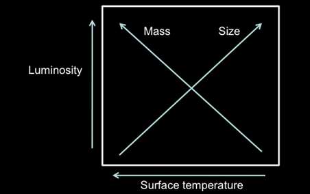
It is traditional to label the X-axis such that the hotter or bluer stars are to the left and the Y-axis such that the stars that are intrinsically the brightest are at the top of the diagram.
Link to the HR Diagram Explorer (opens in another window)
There are also other correlations se can see between position on the HR diagram and stellar characteristics. Notably that radius increases are you move towards the upper right of the diagram.

Most of the stars on the HR Diagram are found in a diagonal region known as the main sequence – these stars are fusing Hydrogen to Helium in their cores. Other regions include giants who are fusing Helium in their cores and white dwarfs that are no longer doing any type of fusion.
